|
Images © H.Talbot
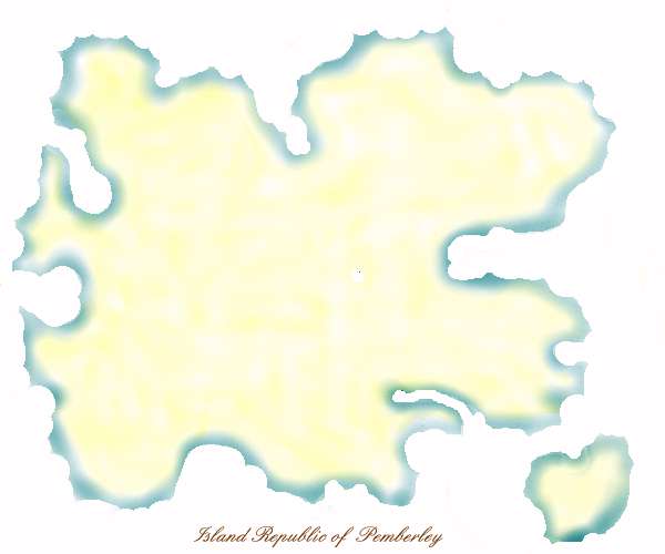
The first and 'blank' version of the Republic of Pemberley map (26.3.97).
Amy and I discovered fairly early in the piece that we liked to play with the idea of Pemberley being an actual place that gave the community a home, and that both of us liked islands, and thought of it as an island. Thats probably a symbol symbolizing something in itself ;-P. When Amy started talking of making a site map for Pemberley, I never really considered that it should not be a real map of the island, it seemed so obviously right. For a long time we intended the map to be the main page and navigation tool for Pemberley, but Amy was eventually persuaded instead to use it as an alternative to a long, mostly text front page.
I used to draw 'pirate maps' for my kids and the kids I taught. They were very cliched, with all the symbols you know .. treasure, palm trees, swamps, ruins, volcanos, sea serpents, wrecks, etc. The land outlines were dictated by whatever one thought would look good. I always liked an intricate coastline with lots of bays and peninsulars for shelter and ambush, and one that occupied the page nicely in a design sense. Occasionally I used to adapt our garden into a pirate map for treasure hunts at Easter time. Anyway, this formula seemed useful for adapting when it came to drawing Pemberley. The map was drawn when I was very new to drawing on the computer, and I had only just started using PSP, and the airbrush. I was playing with airbrushing one colour and then getting edge definition by taking chunks away with the white pen. The Pemberley map outline was one of my first plays with that technique, and the map above was really the very first draft of the map that I tried. I sent it to Amy to simply try the 'feel' on her, intending to mess with making it less 'square' on the page, and various other things, and she immediately thought it was fine as it was. She decided on the strength of it to change the 'of' in her type 'Republic of Pemberley' logo from pink to a blue that would match the blue in the map.
The small island was shaped a bit like a heart because in those days to me the core of Pemberley was that it attracted people 'of the heart', and the Pemberley experience was an adventure of the heart. I was concerned momentarily that it looked too much like Tasmania, but we never moved it. Early on Amy considered the island for newbie orientation, our huddled masses, but instead it became the wizard's (Henry Churchyard's) island.
|
