It’s a problem when inaccurate maps are used in apps that are supplying what might be critical emergency information to the public.
Yesterday in our record heat many people were using Fires Near Me, an app by the NSW Rural Fire Service. It maps and advises on bushfires that are currently burning in NSW. It’s a good development and a useful app. But on an iPhone (there is an android version) it relies on the half-baked Apple Maps. Check out some of the inaccuracies in my region around Canberra. Firstly, here is the accurate Google map of the area (on the left) compared with the Apple Map version.
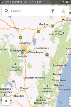
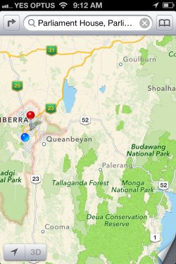
On Apple Maps Cooma and Goulburn are both grossly misplaced, Queanbeyan to a lesser extent. Here’s how Cooma and Goulburn (about 40 km and 20 kms out respectively, and on the wrong sides of the highways) appeared on Fires Near Me yesterday, with the red dots showing where they should be:

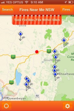
It seems that the fire locations are probably right, but not the towns, but you have to have local or on-the-ground knowledge to know that. Last December Victoria Police spoke of their concern about people being led astray into a wilderness area when they were trying to get to Mildura using Apple Maps. The mistake was not wholly Apple’s, and perhaps this is a similar problem, a confusion over same-named larger council areas.
Luckily yesterday this wasn’t critical, but you can imagine in some scenarios it could be. The app comes with a barrage of disclaimers, and the sensible advice to gather information from a variety of sources. But given the propensity to blame authorities (and more recently, the scientists providing information that warnings are based on) for lack of adequate warning after the fact, even in circumstances that are impossibly unpredictable, you can imagine what would be made of wrong information like this if it did play a role in a bushfire tragedy.
I don’t want to be seen at all as down on emergency service organisations. They do an amazing job and we rely on them. They are also trying to keep up with new technology and avenues of communication, some unrealistic public safety expectations and pressure from an increasingly litigious culture which seems to require scapegoats.


