When I saw that Mary Norton’s The Borrowers had been turned into an animation, The Secret World of Arietty, my knee-jerk reaction was a blurted out tweet (a twurt?):
Oh crap, The Borrowers have been Disney-d. Why can’t they make up their own damn stories?
Or is it anime-d? Probably both.
Then I promptly reread the first four books in the series straight through (for the first time in many years), finishing last night with a satisfied sigh.
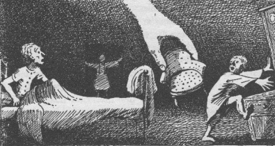
But I’ve had to give myself a talking-to about the adaptation. It turns out that there are numerous previous film adaptations, and a new BBC one coming out this Christmas. If I take a step back from the strong imprint the book made on me as a child, I can see that the things that made me love it also make it an irresistibly rich story for others to reinterpret. And while for me the drawings by Diana Stanley
are inextricably part of how I imagine and experience the story of Pod, Homily and Arietty, it seems Americans have an equally strong association and love of the illustrations done by Beth and Joe Krush.
So instead I’m going to welcome the new adaptations, and enjoy some new ways of seeing The Borrowers, and the new stories created from them. I probably won’t like some of the sentimentality, or the idea of Mild-Eye being redrawn as an evil professor instead of gypsy, but that’s okay, I don’t have to. And maybe those aspects will speak to some who would otherwise never have the pleasure of knowing The Borrowers.


