illustration

Jane Austen stamp illustrations by Angela Barrett

JAstamps

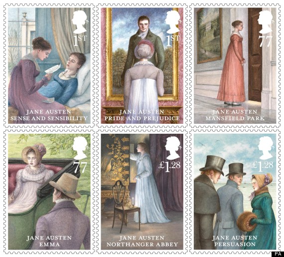
I don’t venture into the world of Jane Austen commentary very much anymore, but did notice some talk about the new Jane Austen stamps released in the UK recently. You can read about them more extensively at Austenprose, where there are also larger versions of each individual one. They were illustrated by Angela Barrett.

Stamps are interesting in the way that they are designed to carry a lot of meaning, but are ephemeral and largely unlooked at in everyday use; and now mostly unused except for collectors. They tend to rely on cultural understandings, large national ones – here pride in JA as an English author – and also more smaller cultural pools – here what is at the heart of what the novels are about, drawing on people knowing the novels well enough to understand what the illustrator is referring to. It’s a lot for an artist to convey in one tiny square of paper!

I was surprised to see them described by a few people as awful. I rather like the sketchy softness alongside quite decorative details. I find myself coming back to look at them and thinking about how Barrett did them and what she picked out as the symbolic moment for each novel – not what I would choose necessarily, but I like her choices. A lot of thought went into them.

One thing that intrigues me is just how much meaning is implied in what initially – and this is perhaps what people were disliking – seem like pretty bland choices of scene and delivery. The Pride and Prejudice illustration seems bland and static but then we know what a revelation his smile was to Elizabeth and how it is a critical moment in her dawning sense of how wrong she has been about him; and the dominance/submissiveness in the picture seems part of her realisation. (Funny, in the light of one friend jokingly terming it  the ‘JA blow job stamp’). The Mansfield Park drawing is quiet and still too, but you can see the warmth and light of family on the other side of the door (both attractive and terrifying), and see all Fanny’s tension in the way she is holding herself and clenching her fists. And again with Emma all the action is in her inward contemplation and shame. We know why and what’s going on in all these moments, without it being spelt out more. This seems rather like the novels themselves, apparently small time in context and lacking in action, but rich with internal observations, understandings and things not said.

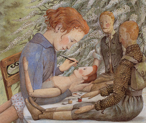
I hadn’t heard of Angela Barrett before but the illustrations I saw on searching are wonderful. Here is another I liked of a doll/puppet maker at work:
angela_barrett

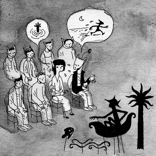
Korea: a shadow puppet


A fine drawing by Alexandre Kha (Mister Kha on Flickr), titled Korea : a shadow puppet.


War Horse


After hearing Adrian Kohler talking about Handspring Puppet Company‘s War Horse at UNIMA 2008 in Perth, I made a special point of seeing it in London later that year when I was travelling. It was remarkable and wonderful.

Since then War Horse has been much celebrated, and has played to increasing audiences, moving from the National Theatre to the West End, and then to Broadway. Most recently it has been staged in Toronto, and, excitingly, it will be in Melbourne’s Arts Centre in December this year.

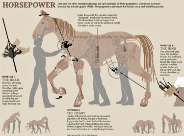
I think the TED talk above is the best demonstration of the puppets I’ve seen outside the theatre. Despite their impressionistic construction with movement, breath and emotional gestures they become breathtakingly alive. (Eric Hart linked to this great infographic by Trish McAlaster on how the puppets work.)


Horsepower: the War Horse puppets and puppeteers infographic by Trish Mcalaster / The Globe and Mail


The horse puppets get most of the interest, which is natural, but there’s also a lovely puppet goose, and an enormous tank that comes on stage, rolling up over a barricade, and rearing over the audience. I really don’t know how they did that! And I also enjoyed the music and loved the minimalist set, essentially a suggested torn piece of paper above the back of the stage, on which simple animations were projected from time to time.

The attitude towards war in the play is unusual, slipping past taking sides, who is in the right or wrong and strategy, and emphasising rather how the horses’ fates are completely subject to the capricious needs and circumstances of humans.

By now War Horse has been made into the inevitable Spielberg movie, which I somehow don’t feel any particular need to see. (For fun take a look at Lisa Hanawalt’s illustrated review). I’m inclined to think that I would agree with Emily Landau’s article Why war Horse’s puppets win by flaunting their artificiality. Apparently an animatronic horse was used for a few seconds for humane reasons in one scene in the movie. I caught a glimpse of this on YouTube a few weeks ago but the video has since been withdrawn.

Lastly, I love the illustration of the Handspring puppets by Byron Eggenschwiler accompanying Landau’s article.

The Borrowers adaptations

When I saw that Mary Norton’s The Borrowers had been turned into an animation, The Secret World of Arietty, my knee-jerk reaction was a blurted out tweet (a twurt?):

Oh crap, The Borrowers have been Disney-d. Why can’t they make up their own damn stories?

Or is it anime-d? Probably both.

Then I promptly reread the first four books in the series straight through (for the first time in many years),  finishing last night with a satisfied sigh.

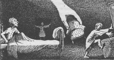
But I’ve had to give myself a talking-to about the adaptation. It turns out that there are numerous previous film adaptations, and a new BBC one coming out this Christmas. If I take a step back from the strong imprint the book made on me as a child, I can see that the things that made me love it also make it an irresistibly rich story for others to reinterpret. And while for me the drawings by Diana Stanley

are inextricably part of how I imagine and experience the story of Pod, Homily and Arietty, it seems Americans have an equally strong association and love of the illustrations done by Beth and Joe Krush.

So instead I’m going to welcome the new adaptations, and enjoy some new ways of seeing The Borrowers, and the new stories created from them.  I probably won’t like some of the sentimentality, or the idea of Mild-Eye being redrawn as an evil professor instead of gypsy, but that’s okay, I don’t have to. And maybe those aspects will speak to some who would otherwise never have the pleasure of knowing The Borrowers.

Beautiful curiosity cabinet illustration

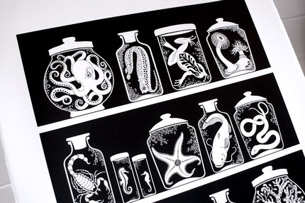
curiosity cabinet by sakurasnow

When I was making the seagull skeleton prop recently, a google image search took me to sakurasnow‘s drawing of a seagull skull, and then more generally to her lovely blog. In particular I love her beautiful curiosity cabinet designs. And I think there are some new ones on the way!  Occasionally they are available in her Etsy shop, and she is also working with them on fabric.

Iphone art: The Hedgehogerus & other flights of fancy

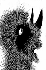
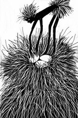
iPhone drawing:  Hedgehogeros surprisediPhone drawing:  The Hedgehogeros nest

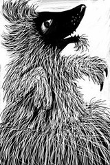
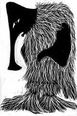
iPhone drawing: The Two-toed Chubbachubb iPhone drawing: The double-pouched Schweep

At the moment I’m entranced with drawing on my iPhone, mostly playing with the Brushes and Paintbook apps. My full set of iPhone drawings is here.

With Brushes I’m presently evolving some strange creatures in a strange environment. Above you can see the Hedgehogerus surprised,  the Hedgehogerus nest and fairy, the two-toed Chubbachubb, and the double-pouched Schweep.

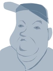
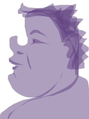
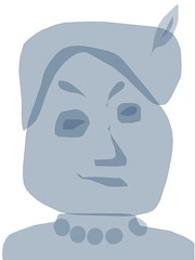
With Paintbook I’ve been making some very simple two-tone faces of (mostly) imaginary people. Here are a few favourites:

iPhone drawing: Maud Bell IPhone drawing: Shane

iPhone drawing: Lillian iPhone drawing: Mrs. Foggerty

It seems as if there is an exciting new field opening up as people experiment with what can be achieved on such a small screen using just your finger. David Hockney has already had an exhibition of his iPhone drawings, and The New Yorker recently drew attention to the phenomenon by featuring an iPhone drawing by Portuguese artist Jorge Columbo as it’s cover illustration. But you get a better feel for the range, quality and some sense of developing community among artists using iPhone apps, at Flickr, for instance in the Brushes gallery.

Saving traditional crafts and records of them

On FriendFeed today Amy today pointed to a British House of Commons debate about trying to save traditional crafts. I rather fear it is a lost cause. The upsurge in crafting and making in the last few years driven by the web is great in many respects, but I suspect probably can do little to help the traditional crafting skills of the sort referred to in the debate, as economies of scale are lined up against them.

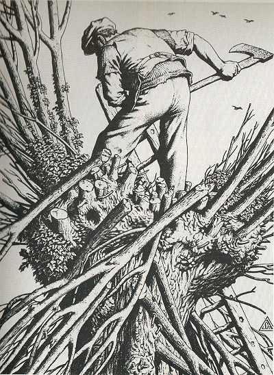
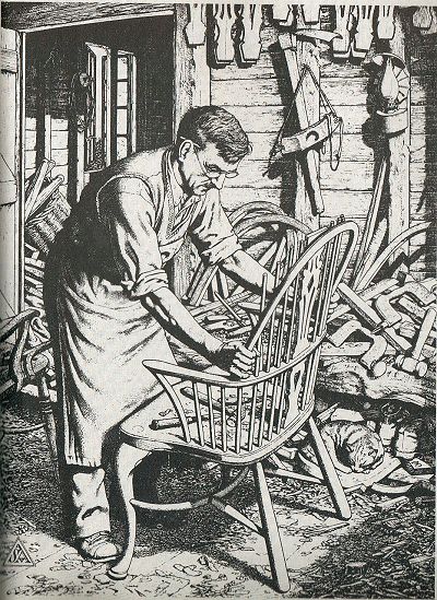
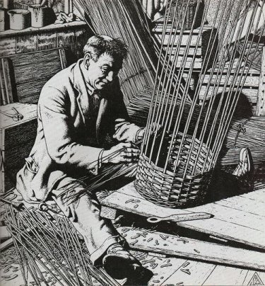
But the article did remind me of some lovely images of traditional craftsmen by printmaker Stanley Anderson. Here are three:

Coppicing:

Coppicing

Chairmaking:

chairmaking

Basket weaving:
basket

These are from Country Bazaar, a 1970’s book about country crafts.  (I’m not sure about copyright here – please let me know if it is an issue). You can find a few more if you google, for instance The Violin Maker, but wouldn’t it be cool if it were possible to see the whole series?

Yay! a Fail Whale card!

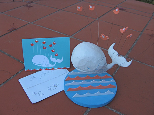
My fail whale card from Yiying Lu!

I’m really happy – Yiying Lu sent me one of her cool Fail Whale cards! Here it is with my little sculpture. Thanks so much Yiying :)

Upside down! Upside down!

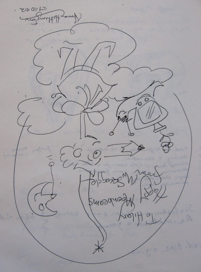
mr.squiggle

I get a lot of interest in my photos of Mr. Squiggle and friends, so I thought people might like to see the squiggle that Mr. Squiggle (aka Norman Hetherington) drew for me personally at the Puppet Summit in Melbourne in 2002. I guess over the years he has drawn them for many people!