illustration

iPhone art

Face

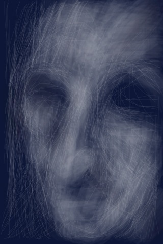
Some of the things you can do on the iPhone just seem like magic to me. This image is drawn on the iPhone screen with my finger, using the Brushes app. It’s taking me a while to get some finesse, but the Brushes Gallery pool at Flickr is ample proof that it is possible.

(btw, Ocarina has been the most jaw-droppingly magic app for me so far.)

3D Illustration

rednose

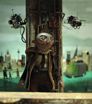
Chris Sickels at Red Nose Studio makes real figures and scenarios that are then photographed to produce cool 3D illustrations for papers, magazines and books.  The 3D illustration above is his cover for Cory Doctorow’s  story The Things That Make Me Weak and Strange Get Engineered Away. Before seeing this I had thought of 3D illustration as more a virtual rendering process.  In this real form it is closely, and interestingly, allied to my work making puppets and props. I recently had a picture of my 3D fail whale published as an illustration in the Japanese computer magazine WEB+DB PRESS. I suppose that is fairly close – the only difference is in your intention when you start making an object?

(via @LolaLulu)

Kicking up my heels

Amophoid

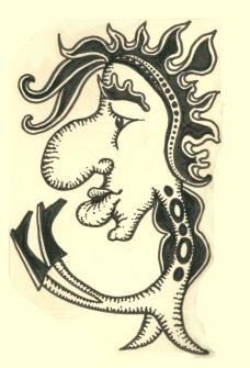
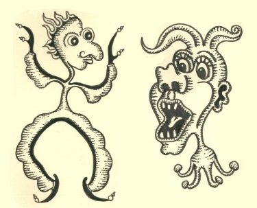
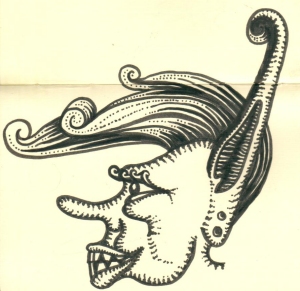
Playing around after discovering the wonderful drawings of Jim Woodring.

Amenoid2

Amophoids3

Austen graphic novels

Ppcomic

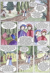
Liz Wong, painter and a freelance illustrator, is making a graphic novel of Jane Austen’s Pride and Prejudice. It should be fun to see how it progresses. I looked around to see if there have been other Austen graphic novels, and yes there are. Anne Timmons’ Northanger Abbey is included in Gothic Classics: Graphic Classics Volume 14. Here is a sample drawing. And a manga style version of P&P, illustrated by Tintin Pantoja is due to be published in about September 2007. If you take the Sequential Art link on her site you can see her version of the first proposal.

In addition to the decisions on how to break up the page, what to zero in on, how to convey action, and what interpretations are being made through image rather than word, I was interested – but not surprised! – to see the influence of Andrew Davies’ 1996 adaptation of P&P.

Green things

Earth2tech

I’m taken with this lovely leaf logo which belongs to a new green blog Earth2Tech (a new part of the GigaOm blog network) which will focus on the business side of green and clean technology.

And check out the cool Power of Wind ad produced by Nordpol+ Hamburg for EPURON, a renewable energy company based in Germany.

(via Laughing Squid)

His Dark Materials illustrations

Pullman2

I’ve finished reading Philip Pullman’s trilogy His Dark Materials now, and I thought it was wonderful. The ideas and characters are still floating round in my head. One of the charms of the trilogy is the little little symbolic illustrations at the beginning of each chapter, drawn in pen and ink by Pullman himself. They are simple, and black and white. Pullman has written about how he did them, and also features them on his site, though the ones for the last book are not up there yet:

View Northern Light illustrations
View The Subtle Knife illustrations

I love the way they pinpoint in a nutshell, the essense of each chapter. My impression is that this doesn’t happen so much in books anymore. We are used to icons and symbols in software, or maps, for example, but those are more to do with function. Trademarks and logos are different again, more about branding and identifying; perhaps, as Michael suggested, a modern version of heraldic design.
The Tale of How

How

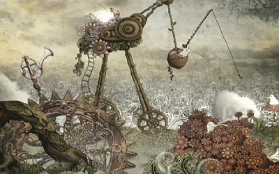
The Tale of How is a beautiful and intreguing animation, a labour of love by three friends calling themselves the Blackheart Gang, who hail from Cape Town, South Africa. It’s the second part of a larger story they envisage, A Dodo Trilogy. Their ‘making of’ video introduces the makers and explains how they went about it.

(via She Dreams in Digital)

Update: Siouxfire has a cool Concise Overview of “The Household”, a series of interviews, production
images, and information on the two follow-ups completing the Dodo
trilogy as well as the following trilogy (the Bear Histories) at Siouxwire. Thanks, Siouxfire!

Till it looked O.K.

Actually, my favourite Sendak picture book is In the Night Kitchen. I love the illustration, the cityscape made from kitchen packets and utensils, the dreamlike whimsy of it, and Mickey’s confidence. Above all, I like the part where he models the dough into a plane:

Ok

What better way to describe how you go about the creative process? I was delighted to find this lovely video animation of the book, adapted and directed by Gene Dietch, complete with jaunty music: