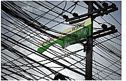
This is a cool idea: the Rejoice Giant Comb! According to How advertising spoiled me it was devised by Somak Chaudhury, an art director from Leo Burnett in Bangkok.
It makes me think of Rohinson Mistry’s novel, A Fine Balance, because the story starts with a vivid image of one of the protagonists buying a comb from a combseller on a train in India, and because hair is a recurrent theme. The book totally
mesmerized me when I read it in January – it’s the finest book I’ve read in a long time – and when I picked it up and paged through the first pages again the other day I realized that inaddition to everything else, it’s a perfect circle. I knew it ended
where it began, but everything at the begining resonates once you have read the whole.
I also recently came across an interesting Adidas advertizing campaign that was run in Berlin. The gist of it was to put up big more-or-less blank billboards, wait till they were covered in graffiti, and then paste over the top an outline of sneakers with cut-outs that showcased parts of the graffiti as the design on the shoe. If you want to trace the whole campaign, start here.
But both ads remind me of the ‘witchcraft’ of advertising in Peter Carey‘s Bliss.
Updated links 2015


