books

Advertizing

rejoice2
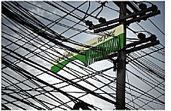
This is a cool idea: the Rejoice Giant Comb! According to How advertising spoiled me it was devised by Somak Chaudhury, an art director from Leo Burnett in Bangkok.

It makes me think of Rohinson Mistry’s novel, A Fine Balance, because the story starts with a vivid image of one of the protagonists buying a comb from a combseller on a train in India, and because hair is a recurrent theme. The book totally
mesmerized me when I read it in January – it’s the finest book I’ve read in a long time – and when I picked it up and paged through the first pages again the other day I realized that inaddition to everything else, it’s a perfect circle. I knew it ended
where it began, but everything at the begining resonates once you have read the whole.

I also recently came across an interesting Adidas advertizing campaign that was run in Berlin. The gist of it was to put up big more-or-less blank billboards, wait till they were covered in graffiti, and then paste over the top an outline of sneakers with cut-outs that showcased parts of the graffiti as the design on the shoe. If you want to trace the whole campaign, start here.

But both ads remind me of the ‘witchcraft’ of advertising in Peter Carey‘s Bliss.

Updated links 2015

Quilt patterns from ‘Alias Grace’

Lucy Tartan’s review of Margaret Atwood’s novel Alias Grace over at Sorrow at Sills Bend this morning prompted me to go hunting for my sketch of all the quilt square patterns that were used as chapter illustrations. I liked how the motif worked in with the story and themes of each chapter much better than I liked the book overall.

Quilt squares

I always intended to make a sketch of all the knots used similarly in E. Annie Proulx’s wonderful book, The Shipping News, but haven’t as yet.

I once heard an interview with Margaret Atwood; it must have been on the ABC. In it I think – and I might be mistaken, I’d like confirmation – she defined the novel as writing that always has the notion of a clock in it. Does anyone else remember that? I guess it implies that there is always a timeline and a narrative, but being me, I started thinking of clocks and watches and other time pieces!

While you are at Sorrow at Sills Bend, don’t miss the rats and hydatid posters!

Shaun Tan’s website and Aquasapiens

aqua51

Shaun Tan now has his own website. It looks relatively new. It’s great to see a number of illustrations under each picture book listing, and read his thoughtful and friendly commentary. I was also delighted to see some images from the puppetry-based theatre production of The Red Tree, which was produced as part of the Queensland Performing Arts Centre’s ‘Out of the Box’ festival for children in 2004. I had heard about this wonderful fish puppet on the grapevine. There are also some in-theatre pictures of some of our puppets for Jigsaw Theatre’s production of The Lost Thing.

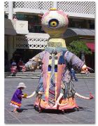
One project that was unknown to me before, is Aquasapiens. Tan was commissioned by Spare Parts Puppet Theatre in Fremantle, WA, to design large-scale puppets for a street theatre event as part of the 2005 Perth International Arts Festival. The director was Philip Mitchell, the puppet maker Jiri Zmitko and sound designer/composer Lee Buddle. These creatures are fabulous! Here are drawings of the Yellow Naut and ‘Shrimpy’. I also love this.

Aquasapiens is going to be part of the Adelaide Fringe in February and March, and is available to perform at schools from February 27 to March 10.

Apparently Spare Parts will also be adapting another of Tan’s books, The Arrival, which is about migration and is due to be published in April.

updated links 2015

The Magic of Marionettes by Anne Masson

I remembered yesterday that the tip about storing marionettes by twirling them so the strings twist up together (in the comments under my last post) came from a lovely book called The Magic of Marionettes by Anne Masson. It was given to one of my kids, but I got a great deal out of it too, not so much because it was about puppets, but because it is written with a real understanding of the delight and empowerment that creating and making something can give you.

The book covers how to make the puppets, how to put on a performance, write a simple play, and it discusses props, scenery, sound effects and scripts that might be used, while keeping lots of room for individual creativity, and emphasizing that the process is as important as the result.

Look Both Ways: Sarah Watt’s animations

Lookbothways

(Image from Dendy Films)

I’m delighted the movie Look Both Ways did so well at the Australian Film Awards this weekend, taking out Best Film (Bridget Ikin), Best Direction (Sarah Watt), Best Original Screenplay (Sarah Watt), and Best Supporting Actor (Anthony Hayes).

Its a real gem: everyday, quiet, low key and unpretentious, but deals in subtle and intense ways with life and death and the things in between. Sarah Watt says: “I try and say things like it’s a romantic comedy. But unfortunately I have a tendency to look on the blacker side of life, so I suppose it’s a romantic comedy about fear, maybe, with a little death thrown in.” She has also said “I guess it’s a thing of feeling like you’re extremely fortunate, but with an awareness of how many troubles there are in the world and figuring out how to live with that fortune, whilst not stomping on the heads of those less fortunate. That’s a line that a lot of Australians have to tread daily.”

Look Both Ways is set in Adelaide, where I grew up, and it’s always fun to see familiar places in movies, especially when it doesn’t happen very often. (Shine was the last time for me). Most of the filming was done down towards the port, and the sense of atmosphere, light, dryness and heat haze was absolutely recognizable as a stinking hot Adelaide heatwave.

Another striking feature is the short animations which were done as a collaboration with Emma Kelly (from Tantalus Interactive) and Clare Callinan:

‘Animator Emma Kelly (who collaborated with Sarah on her shorts) drew all the cells over several months. Each drawing was scanned and printed onto suitable water-absorbent paper. Sarah then hand-painted all the ‘watery’ sequences, and Clare Callinan (again a previous collaborator) painted the other sequences, with Sarah finishing each painting. All the painted cells were then re-scanned at Iloura Digital Pictures in Melbourne, camera moves were resolved, and the sequences were recorded out onto 35mm, for integration into the film.’

The animations represent the internal lives of the two main characters. In accordance with their professions, Meryl’s are painterly, and represent her often fearful thoughts (clips (1, 2), while Nick’s are more photographic montage and are visual memories of his life (just a taste in this trailer). There are a couple of other trailers on the LBW site.

I came across another of Watt’s animations online. It’s from a twenty-three minute animation The Way of the Birds, based on a book of the same name by Meme McDonald. It tells the story of the Eastern Curlew:

‘After breeding and nesting in the Siberian grasslands, the adult birds migrate south again within a month or so, leaving their chicks there in the tundra. When they are less than eight weeks old, the chicks make the 13,000 km migration across the world to parts of Australia and Aotearoa/New Zealand all on their own.’

There are also animations by Watt in an associated online documentary about the Eastern Curlew, A Year on the Wing.

Updated 2015: broken links. Sarah Watt died in 2011.

The Theft of Sita

Sita

(Photograph: Julian Crouch)

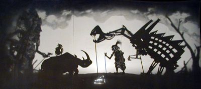
PuppetVision recently referred to The Modern Shadow where Michelle Zacharia is exploring combining Indonesian Wayang Golek puppetry and video and digital production techniques, and thinking about western influences in Indonesia. It reminded me of a production here called The Theft of Sita which was commissioned by the 2000 Adelaide Festival of Arts and received acclaim both here and overseas. It was a modern retelling of the Ramayana using shadow puppetry, and involved a remarkable collaboration of artists, puppeteers, makers and musicians.

The piece was written and directed by Nigel Jamieson (AU); music composed by the Australian jazz musician Paul Grabowsky (AU) and Balinese gamelon artist I Wayan Gde Yudane; designed by Julian Crouch (UK); and the puppetry directors were Peter J. Wilson (AU) and Balinese master I Made Sidia (who both performed in the show).

This Ramayana begins conventionally, but quickly explodes into a metaphor of the tumultuous events surrounding the overthrow of Suharto. Computer-generated images and photographic projections of demonstrations coexist with giant shadow puppet logging beasts. There are white water rafters and withering paddy fields in Bali. And Langka becomes a futuristic city of gleaming steel and glass towers, and of rubbish tips. Giant screens lift and disappear, perspective shifts from screens at the front to screens at the back of the stage. Shadow puppets emerge on tiny screens in the middle of the space and then shift again.

Robin Laurie, Inside Indonesia, The Theft of Sita

Robin’s article is worth reading in full, as is Peter Wilson’s account in his book ‘The Space Between: The Art of Puppetry and Visual Theatre in Australia’, where he describes The Theft of Sita as a transformation of the ancient tale into a modern allegory of environmental politics.

Unfortunately I didn’t see The Theft of Sita, but I have seen a TV program that was made about it.

The designer, Julian Crouch, has a gallery showing some of the wonderful shadow puppets and scenes from the show, including the one above. His other galleries have some gems in them, too. Just a couple of examples: a dog, some huge figures, and some rather beautiful arresting star faces.

Update 2015: broken links; also, try a Julian Crouch google image search

Pride & Prejudice 3 (2005) Review: The flat-chested adaptation

I saw P&P3 last night. It was released the day before (after a few advance screenings last weekend), but at the 9.30pm Friday show there were not many more than a scattering of people in the theatre. I was surprised at that.

Talk about feeling the history when I went to see this. As the first scene rolls, it’s dawn and the birds are just starting to sing. My first thought was, ‘I wonder if Martti Alatalo (Birdcalls in P&P2 pdf) is watching this and whether he will rate it as ‘a movie without obvious bird flaws’?’. LOL.

It’s an enjoyable movie, but I’m quite critical of it.

Amy used to call Jane Austen The SquirmMeister, and my main feeling about this P&P is that it has all but taken out that essential JA squirm factor. It lacks the nuances that make the comedy, irony and tension that we love. There are examples, but there are not nearly enough ofthem. It seems to be another move away from humour and satire towards small-r romance, rather than accommodating both.

Part of the trouble is that time is so short. There is so much story to get through, that there is not enough time to develop the highs and lows and build tension in between. In that sense the movie is itself, ironically, rather like those quickly developed but shallower relationships that Austen pitches as an antithesis to the deep successful ones: the Charlotte/Collins match (or, more kindly, the Jane/Bingley match) as opposed to the Lizzy/Darcy one.

The Wickham plot is relegated to a minor sideline, so there is no real depth to that whole side of the ‘first impressions’ theme. Charlotte’s plight is well expressed, but her cunning is absent, and her tragedy is not even hinted at. She is quite gleeful at having her own house. It’s interesting to see Collins played in a completely different way, and it works on one level, but he is pathetic rather than funny most of the time. Likewise Lady Catherine is severe, Mrs Bennet is kinder and less stupid, and Caroline Bingley is snide, without much irony, fun or squirming being drawn from their characters.

I was surprised to find Mr. Bennet an exception. In fact, I think Donald Sutherland’s portrayal was the highlight of the film for me. He is not given as much wit and cynicism as he should have, which is a pity, but there are some delightful moments of dry humour and shared twinkles and understandings between him and Lizzy. He was played with great depth, and I loved his growly gravelly affection.

One major problem for me was that I didn’t feel I was given any reasons why Jane or Lizzy especially liked and wanted Bingley and Darcy, apart from gratitude on Lizzy’s part (I know gratitude is a major turning point in the book too, but it needs to be more than gratitude, doesn’t it?). Bingley did have tolerable teeth, but he blithered and had a completely distracting crest of red hair (a la Kyle Sanderland). Darcy looks mopey rather than haughty much of the time, though he becomes a bit more convincing and attractive towards the end of the movie. The conversations we see between Lizzy and Darcy are at times more true to the book than P&P2. For example during the dance at the Netherfield Ball, its Lizzy who is flustered and provokes Darcy, whereas in P&P2 it’s portrayed as a more equal sparring battle and stand-off. At other times its not so – the first proposal turns into a flaming row. I think the film asks me to just accept that these couples fall in love because its inexplicable why certain people fall in love, rather than showing me why they like each other so much or find each other attractive. Davies was impeccible in sharing the attraction with the audience, and pacing the dramatic tension. This one falls somewhat flat in comparison on both scores.

KK’s Lizzy is good, though I found her frequent and instant giggle-with-nose-wrinkled annoying. Jane is wonderful. I liked the girls being so young, but didn’t like the Gardiners and others being so old. Liked the rural setting and all the animals. Didn’t find it Bronte-ish. Thought the scene where Lizzy and Darcy talk outside at Pemberley was well done. Thought the scene previous to that, her peeping in on Georgiana and Darcy was wrong, and the one before, with the white sculptures, was over-the-top and a silly.

Disliked Lady Catherine arriving at night and all the others listening at the door. Disliked where Lizzy gets Jane’s letter and tells Darcy about Lydia’s fall in the Gardiner’s presence – the tension was completely thrown away, and we don’t really feel what tremendous loss she feels at that point. Ditto when Darcy returns to Netherfield and Lizzy doesn’t know how he feels. Thought the second proposal was schmaltz visually. Georgiana was young, which I liked, but not nearly demure enough. Wickham looked good, but for what use when his whole subplot was nixed? The music in the first scene fades into Mary playing the piano, which was a bit odd. And at the first assembly ball its just a group playing, but an orchestral recording.

There are few full bosoms. I’m sorry to disappoint, but like the movie, there it is.

Update:

I’ve decided its more Hardy (a la the movie ‘Far from the Madding Crowd’) than Bronte. The director sites it as an influence.

The US gets a ‘kissy-face ending’.

Most enteraining reviews:
Laura Carroll at The Valve: Pirates of Pemberlay (via Loobylu)
Anthony Lane at the New Yorker
Margaret Olley & Maxine McKew

Maxine McKew (7.30 Report) did a lovely interview the other night with artist Margaret Olley. Part of the charm was non-verbal, the smiling eyes, expressions, gestures, the unsaid knowingness, on each side. But this was my favourite part of the verbal :

MAXINE McKEW: You’ve said you paint for yourself. Is that right?

MARGARET OLLEY: I do. Who would you paint for?

MAXINE McKEW: So you don’t have a particular market in mind or?

MARGARET
OLLEY: Oh, perish the thought! No, the only reason you have an
exhibition…is really, that moment when they say “it’s up”.

MAXINE McKEW: The book also documents…some dark moments and one of them of course is your battle with alcoholism.

MARGARET OLLEY: Oh, yes. Whatever I do, I do it to excess. (Laughs). Whatever I do, I do it to excess.

(via Articulate)

I’m fond of Maxine McKew. She is an astute political interviewer, a feminist, and an excellent presenter, and then occasionally you also get to see her conduct a more relaxed personal interview like this. Another I particularly remember was a conversation with Yasmine Gooneratne, an English literature academic, about the rash of Jane Austen adaptations. It was obvious from twinkling eyes that McKew appreciated Andrew Davies’ 1995 adaptation of Pride and Prejudice.

Incidentally, the Gooneratne family run Pemberley House, an International Study Centre in Sri Lanka, which I think is essentially a retreat. I’ve always thought it would be fun to visit there. Thinking about the attraction now, I’m wondering if there is something about the look of it – perhaps a similarity with Natal? – that triggers some memory from my South African childhood. I only lived there until I was 7, and don’t think of myself as rememering much about it, but I was listening to J. M. Coetzee reading his South African book Boyhood on First Person recently, and was astounded at how evocative it was for me. I instinctively understood words that I had not heard since I was little, and could see again scenes that I had forgotten I knew.

Updated links 2015

Letting it rip!

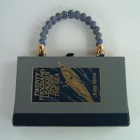
BookRebound Designs takes old books and turns them into bags. I’m not a handbag user, so in a practical sense they are lost on me, but they are really cool. I took a spin past a couple of the op shops the other day, and came home with a few books to experiment with. Maybe I can make a few Christmas presents this year?

Strange how it feels naughty to rip the pages out, even for books I don’t feel any relationship with. I found four Reader’s Digest condensed book volumes with pretty covers that I don’t feel too bad about remixing. I think they must be in the same series as this one.

I doubt I could have done it to this one. I did get a Dean & Son abridged Pride and Prejudice, with an amusing gaudy cover, but I escape any dilemma because its spine is too thin.

Did you ever do that thing of cutting a secret compartment in the pages of a book? I remember it taking a lot of grunt to cut through all the pages!