film

Look Both Ways: Sarah Watt’s animations

Lookbothways

(Image from Dendy Films)

I’m delighted the movie Look Both Ways did so well at the Australian Film Awards this weekend, taking out Best Film (Bridget Ikin), Best Direction (Sarah Watt), Best Original Screenplay (Sarah Watt), and Best Supporting Actor (Anthony Hayes).

Its a real gem: everyday, quiet, low key and unpretentious, but deals in subtle and intense ways with life and death and the things in between. Sarah Watt says: “I try and say things like it’s a romantic comedy. But unfortunately I have a tendency to look on the blacker side of life, so I suppose it’s a romantic comedy about fear, maybe, with a little death thrown in.” She has also said “I guess it’s a thing of feeling like you’re extremely fortunate, but with an awareness of how many troubles there are in the world and figuring out how to live with that fortune, whilst not stomping on the heads of those less fortunate. That’s a line that a lot of Australians have to tread daily.”

Look Both Ways is set in Adelaide, where I grew up, and it’s always fun to see familiar places in movies, especially when it doesn’t happen very often. (Shine was the last time for me). Most of the filming was done down towards the port, and the sense of atmosphere, light, dryness and heat haze was absolutely recognizable as a stinking hot Adelaide heatwave.

Another striking feature is the short animations which were done as a collaboration with Emma Kelly (from Tantalus Interactive) and Clare Callinan:

‘Animator Emma Kelly (who collaborated with Sarah on her shorts) drew all the cells over several months. Each drawing was scanned and printed onto suitable water-absorbent paper. Sarah then hand-painted all the ‘watery’ sequences, and Clare Callinan (again a previous collaborator) painted the other sequences, with Sarah finishing each painting. All the painted cells were then re-scanned at Iloura Digital Pictures in Melbourne, camera moves were resolved, and the sequences were recorded out onto 35mm, for integration into the film.’

The animations represent the internal lives of the two main characters. In accordance with their professions, Meryl’s are painterly, and represent her often fearful thoughts (clips (1, 2), while Nick’s are more photographic montage and are visual memories of his life (just a taste in this trailer). There are a couple of other trailers on the LBW site.

I came across another of Watt’s animations online. It’s from a twenty-three minute animation The Way of the Birds, based on a book of the same name by Meme McDonald. It tells the story of the Eastern Curlew:

‘After breeding and nesting in the Siberian grasslands, the adult birds migrate south again within a month or so, leaving their chicks there in the tundra. When they are less than eight weeks old, the chicks make the 13,000 km migration across the world to parts of Australia and Aotearoa/New Zealand all on their own.’

There are also animations by Watt in an associated online documentary about the Eastern Curlew, A Year on the Wing.

Updated 2015: broken links. Sarah Watt died in 2011.

Snort! : nonsense regarding The Pig

The moniker for the new adaptation of Pride and Prejudice is likely to be ‘the Kiera Knightley version’, but I am going to campaign for ‘the one with the pig’ until someone does a Wishbone-type adaptation with Babe animatronic technology (starring the pig) or puppet pigs (move over Miss Piggy, I don’t want a Muppet version!). I’m amused by the fuss the pig is causing – ‘It shouldn’t be in the house’ – ‘How many times must I explain it’s not in the house’ – ‘It’s too rural and makes the Bennets seem too poor’ – because I suspect the distaste probably stems more from the implication intended by juxtaposing the stud pig with Mrs Bennet gloatingly sending Jane over to Bingley at Netherfield:

iW: Then you have this pig walk by and he has enormous balls.

JW: That’s not something we thought of before we saw the pig. Then when we met the pig, we were incredibly impressed by him. I’m rather interested in the fact that a family like the Bennets would only own female pigs. They’d hire the male pig to come in and, as they call it, cover the sows, at a fee. I kind of liked the parallels between human and animal procreation.

Joe Wright, Director

This rather puts new life into a rather jaundiced cartoon I did a few years ago:

Snort!

The only other Austen cartoon I made was this one of Charlotte shrewdly eyeing off Mr Collins:

All your base

Of course you could add cartoon bubbles to the pictures in the Jane Austen Colouring Book.

Pride & Prejudice 3 (2005) Review: The flat-chested adaptation

I saw P&P3 last night. It was released the day before (after a few advance screenings last weekend), but at the 9.30pm Friday show there were not many more than a scattering of people in the theatre. I was surprised at that.

Talk about feeling the history when I went to see this. As the first scene rolls, it’s dawn and the birds are just starting to sing. My first thought was, ‘I wonder if Martti Alatalo (Birdcalls in P&P2 pdf) is watching this and whether he will rate it as ‘a movie without obvious bird flaws’?’. LOL.

It’s an enjoyable movie, but I’m quite critical of it.

Amy used to call Jane Austen The SquirmMeister, and my main feeling about this P&P is that it has all but taken out that essential JA squirm factor. It lacks the nuances that make the comedy, irony and tension that we love. There are examples, but there are not nearly enough ofthem. It seems to be another move away from humour and satire towards small-r romance, rather than accommodating both.

Part of the trouble is that time is so short. There is so much story to get through, that there is not enough time to develop the highs and lows and build tension in between. In that sense the movie is itself, ironically, rather like those quickly developed but shallower relationships that Austen pitches as an antithesis to the deep successful ones: the Charlotte/Collins match (or, more kindly, the Jane/Bingley match) as opposed to the Lizzy/Darcy one.

The Wickham plot is relegated to a minor sideline, so there is no real depth to that whole side of the ‘first impressions’ theme. Charlotte’s plight is well expressed, but her cunning is absent, and her tragedy is not even hinted at. She is quite gleeful at having her own house. It’s interesting to see Collins played in a completely different way, and it works on one level, but he is pathetic rather than funny most of the time. Likewise Lady Catherine is severe, Mrs Bennet is kinder and less stupid, and Caroline Bingley is snide, without much irony, fun or squirming being drawn from their characters.

I was surprised to find Mr. Bennet an exception. In fact, I think Donald Sutherland’s portrayal was the highlight of the film for me. He is not given as much wit and cynicism as he should have, which is a pity, but there are some delightful moments of dry humour and shared twinkles and understandings between him and Lizzy. He was played with great depth, and I loved his growly gravelly affection.

One major problem for me was that I didn’t feel I was given any reasons why Jane or Lizzy especially liked and wanted Bingley and Darcy, apart from gratitude on Lizzy’s part (I know gratitude is a major turning point in the book too, but it needs to be more than gratitude, doesn’t it?). Bingley did have tolerable teeth, but he blithered and had a completely distracting crest of red hair (a la Kyle Sanderland). Darcy looks mopey rather than haughty much of the time, though he becomes a bit more convincing and attractive towards the end of the movie. The conversations we see between Lizzy and Darcy are at times more true to the book than P&P2. For example during the dance at the Netherfield Ball, its Lizzy who is flustered and provokes Darcy, whereas in P&P2 it’s portrayed as a more equal sparring battle and stand-off. At other times its not so – the first proposal turns into a flaming row. I think the film asks me to just accept that these couples fall in love because its inexplicable why certain people fall in love, rather than showing me why they like each other so much or find each other attractive. Davies was impeccible in sharing the attraction with the audience, and pacing the dramatic tension. This one falls somewhat flat in comparison on both scores.

KK’s Lizzy is good, though I found her frequent and instant giggle-with-nose-wrinkled annoying. Jane is wonderful. I liked the girls being so young, but didn’t like the Gardiners and others being so old. Liked the rural setting and all the animals. Didn’t find it Bronte-ish. Thought the scene where Lizzy and Darcy talk outside at Pemberley was well done. Thought the scene previous to that, her peeping in on Georgiana and Darcy was wrong, and the one before, with the white sculptures, was over-the-top and a silly.

Disliked Lady Catherine arriving at night and all the others listening at the door. Disliked where Lizzy gets Jane’s letter and tells Darcy about Lydia’s fall in the Gardiner’s presence – the tension was completely thrown away, and we don’t really feel what tremendous loss she feels at that point. Ditto when Darcy returns to Netherfield and Lizzy doesn’t know how he feels. Thought the second proposal was schmaltz visually. Georgiana was young, which I liked, but not nearly demure enough. Wickham looked good, but for what use when his whole subplot was nixed? The music in the first scene fades into Mary playing the piano, which was a bit odd. And at the first assembly ball its just a group playing, but an orchestral recording.

There are few full bosoms. I’m sorry to disappoint, but like the movie, there it is.

Update:

I’ve decided its more Hardy (a la the movie ‘Far from the Madding Crowd’) than Bronte. The director sites it as an influence.

The US gets a ‘kissy-face ending’.

Most enteraining reviews:
Laura Carroll at The Valve: Pirates of Pemberlay (via Loobylu)
Anthony Lane at the New Yorker

A peep into the making of The Curse of the Were-Rabbit

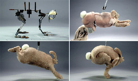
The New York Times has a short slide-show of some of the sketches and models from the latest Wallace and Gromit movie, The Curse of the Were-Rabbit. I like seeing the armatures and insides:

Gromitbts

Nick Park gives the commentary. I’m not a huge fan of Aardman, but I was sorry to see the Aardman Animation studios had burnt down last week, with many of the original drawings, wooden sets, paperwork, awards and other memorabilia lost.

King Kong

The trailer for Peter Jackson’s King Kong is out. They are also running a post-production diary in blog and video format. This could well have happened before, but its the first time I have come across it, as opposed to releases of a few stills and clips. Jackson has always embraced new avenues in the media, and I think this is another example.

‘The Lost Thing’ to become a short film

LtboyHaving made puppets for a theatre production of Shaun Tan’s ‘The Lost Thing’ last year, I was excited to find out that Passion Pictures is making a short CG film of the book. It will be fun to keep an eye on their gallery of pictures of work in progress over the next months. Among the images there at the moment are drawings of some of the utopian lost things. There were only five utopian lost things in the theatre production, so it will be great if we get to see more of them brought to life in the film. There are also images of a sculpture of the boy by Ron Mueck Mueck, that will be used for mapping the boy from all angles into the CG program. How cool is that!

Lord of the Rings Exhibition at the Powerhouse

The Powerhouse Museum in Sydney is hosting a great exhibition to do with how Lord of the Rings Motion Picture Trilogy was created. Its been running since late December, and will close on April 3rd.

There is a lot to see: props, jewellery, weaponry, armour, costumes, models, artefacts, design drawings and paintings, marquettes, moulds, the Ring itself, and prosthetics. There is also a swag of video coverage about how the digital effects, special effects and make-up were achieved, and video interviews with cast and crew, though a lot of that already appears on the extended DVD.

I’m not a great fan of Lord of the Rings. Its unrelentingly male, and I’ve always appreciated the joke that Shelob is the most convincing female character. But there was lots to enjoy about the films, and this exhibition. My overwhelming impression was how wonderfully detailed everything was, and how much thought and care had been given to its making.

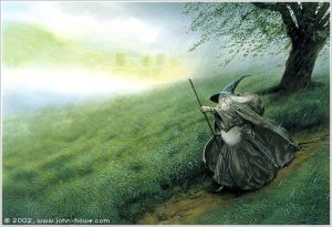
Gandalf’s grey robe is made of a beautiful rough mixture of natural fibres, (linen, hemp and silk, if I remember correctly) woven locally in NZ. I got a buzz out of seeing his wonderful bent felt hat (after John Howe’s great illustrations) , as well as all his ancient tomes. And lying among them, the charming surprise of his toffee bag, a small drawstring leather pouch!

Gdf2

Gandalf the Grey (courtesy www.john-howe.com – cool site!) Despite being a real Cate Blanchett fan, I had been disappointed with how Galadriel’s character was written in the film. But her dress was stunningly beautiful, white and luminescent. In contrast, the vacant dark Ring Wraith’s costume had a real sense of foreboding about it.The jewellery, weapons and objects like sword sheaths and straps were beautifully crafted and decorated. It was fun to see Frodo’s mithril coat of mail, and actually handle samples of the chain mail that was painstakingly made for Gimli’s and other characters’ costumes.

There were reproduction models (specially made for the exhibition) of Treebeard’s head, the cave troll and a goblin, which were cool. I loved seeing the marquette of Shelob’s head, and finding out that she was modelled on a tunnel web spider that the Kiwi designer Christian Rivers found in his garden. Of the building or scene models, I particularly liked the ruined Hobbiton Mill.

From a maker’s point of view it would have been good to find out in more detail the exact process of how some of these things were made, and the materials that were used, but I guess that would be catering to too specialist an interest. I haven’t read The Making of the Lord of the Rings, but I doubt that would go to that level of detail either.

I hoped to be able to buy a postcard of Galadriel’s dress to send to a friend’s daughter, but the merchandise in the inevitable shop at the end was boring, just the usual stuff that has been around in shops anyway. You would think that it would have been worthwhile for both sellers and buyers to have some merchandise available that actually reflected the finer focus of the exhibition.

You are meant to book for the exhibition if you are not a member, though the crowds had dropped off when I saw it a few weeks ago, and it was easy to get in. If you decide to go, its worth considering a membership to the Powerhouse. We qualified for a ‘rural family’ membership which cost $2 more than entrance to the exhibition, and gives us other perks for the year ahead not only at the Powerhouse, but places like the National Gallery of Australia and Questacon.

Harvie Krumpet on SBS

Adam Elliot’s animation Harvie Krumpet won an Oscar yesterday for best short animated film. It has already been shown in cinemas in Melbourne and Sydney, but next Monday we can all catch it on SBS at 9pm. The ABC Radio National program The Makers, always worth a listen, has an interview with Elliot on audio this week, and there is an interesting online interview with him, with a variety of the characters pictured, at Sleepy Brain.